Key UX Design Principles for a Great User Experience
It’s almost impossible to define an outstanding user experience in every scenario beforehand. It might be hard to distinguish between excellent and poor user experiences.
What makes a positive experience is often arbitrary, and it will likely differ between individuals or situations. Understanding the user’s perspective is critical to the user experience design process.
These Key Principles of User Experience Designing can serve as a guide for solid UX design:
User Experience Design: User Experience must be characterized in the beginning to comprehend what makes for exceptional UX design. The task of a user experience designer is diverse, even though it is prevalent in software product & Web development. UXD is a human-centered approach to product creation that revolves around the requirements and needs of the target audience. Still, we’re familiar with it from our interactions with digital apps.
Understanding Good UX: How can we judge what is excellent and what isn’t if what we build is subjective to the individuals we’re creating for? Fortunately, various professionals have researched this topic and developed guidelines and principles to ensure that a positive user experience is possible regardless of the audience.
Nielsen Norman heuristics
The Nielsen Norman Group’s Don Norman and Jakob Nielsen have served as a source of knowledge for the user experience community. They’ve acquired information about what makes for compelling experiences by focusing on research-based user experience design. Their list of interface design heuristics is frequently cited by literature that lays forth guidelines to create experiences.
* System status visibility: Users should constantly be updated promptly on what the system or product is doing.
* System and real-world compatibility: Avoid using technical terms. The product interface should employ terminology and language that the user is comfortable with.
* User autonomy and control: When mistakes occur, create an escape route. Supporting Undo and Redo and ways for canceling operations is one approach to do this.
* Standards and consistency: Don’t start from scratch. Look for common trends across platforms. Users should not have to guess what anything implies because they are familiar with standards and patterns.
* Error prevention: It’s crucial to provide feedback when a mistake happens, but it’s much better if you can help prevent an issue from happening in the first place. It is advantageous to provide sensible defaults and confirmation.
* Recognition rather than recall: Reduce the stress on memory and recall to improve usefulness. Instead of hiding crucial activities behind menus, make them transparent so users wouldn’t have to recollect their whereabouts.
* Flexibility and efficiency of use: Provide an experience tailored to both novice and experienced users. Offer methods for expediting workflows and helping users unfamiliar with the system.
* Aesthetic and minimalist design: Excessive information should not be displayed to users. To enhance visibility and clarity, keep displays and dialogues focused and simple.
* Assist users in identifying, diagnosing, and recovering from mistakes: It’s impossible to eliminate errors permanently. It may happen anyhow, and it’s critical to assist users in understanding what went wrong and how to fix it in clear English.
* Assistance and documentation: Although it is preferable to anticipate the need for guidance and paperwork, it is critical to ensure that it is available when it is required. Make it as easy as possible for users to get support, and deliver it contextually as needed in plain, straightforward language.
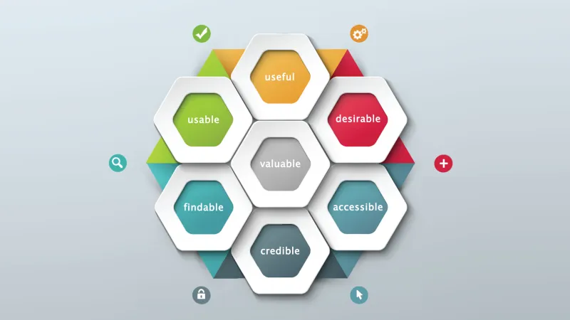
Peter Morville’s User Experience Honeycomb
Peter Morville devised the User Experience Honeycomb to describe the many aspects of user experience to clients. Like Jakob Neilsen’s heuristics, Peter’s Honeycomb highlights essential principles for a successful user experience.

* Usefulness: Feature requirements are frequently used or are a list of elements included in a product. Is the product we’re designing beneficial as User Experience Designers? Is it assisting someone in achieving their objective rationally and consistently?
* Usability: Usability and the ease with which someone can operate a product come to mind when we think of user experience. It is necessary for the experience, even if it is not adequate.
* Desirable: Is the audience interested in what we’re creating? Making a product usable and helpful is one thing, but it’s another to make it desired. People want to have a good time.
* Findable: Getting lost in a labyrinth or a digital product is not enjoyable. Finding what you’re searching for may not get you glowing ratings, but having a difficult-to-use effect will.
* Accessible: Our consumers’ talents vary as much as the things they utilize. Designing a product without addressing accessibility creates barriers for some people, resulting in a limited experience.
* Credible: On the internet nowadays, there is a lot of misleading information. Providing a safe and secure environment for your product’s consumers is critical to today’s product experiences. Copycat websites, email scams, and data privacy concerns are just a few challenges.
* Valuable: It is all for naught if a consumer does not receive value from experience. There is little motivation to return to a website, regardless of how nice, usable, or attractive it is.
Conclusion
When you combine Peter’s Honeycomb with usability heuristics, you may start to grasp and define what “good” in user experience means. Many more standards and principles guide your practice, but sticking to them will set you on the right track to developing a fantastic user experience with your following product or service.
Talk to our team for effortless, exponential business outcomes for world-class UX design services.
Source: Abobe