- March 25, 2026
- by Parbeshkumar Maurya
The Science of Email Rendering: Why Your Emails Look Different Across Clients (And How to Fix It)
A brand launched what they believed was their best email campaign yet. The design was clean. The visuals were sharp. The copy was compelling. Everything looked perfect inside the editor.
Then they hit send.
Within hours, the feedback started coming in. Some users saw broken layouts. Others couldn’t read the text. Buttons were misaligned. And in Outlook, the entire email looked completely off.
Same email. Completely different experiences.
That’s when they realized something critical: The problem wasn’t the design. It was the rendering.
In this blog, we’ll break down what email rendering really means, why emails look different across clients, what impacts it, and most importantly, how to fix it.
In this blog, we’ll break down:
What Is Email Rendering?
When you create an email, you’re not just designing a visual – you’re writing code. Behind every image, button, and section is HTML and CSS that instruct email clients how to display your message.
But unlike websites, email clients don’t follow a single standard.
Gmail, Outlook, Apple Mail, and Yahoo all interpret the same code differently. So when your email reaches the inbox, it isn’t simply displayed, it’s reconstructed based on the rules of that specific client.
And that reconstruction doesn’t always go as planned.
Why Emails Look Different Across Clients
1. Different Rendering Engines, Different Results
One of the biggest reasons emails break is that each email client uses a different rendering engine.
Outlook relies on Microsoft Word to render emails. Gmail strips out certain CSS styles. Apple Mail supports more modern web standards.
The result? The same email behaves differently depending on where it’s opened.
2. Limited Support for HTML and CSS
Email is not the web and that’s where many marketers get caught off guard.
Modern CSS features often don’t work in email environments. This is why developers still rely on table-based layouts, inline CSS, and simplified structures.
It may feel outdated, but it’s what ensures consistency.
3. Device and Screen Size Differences
Your email isn’t viewed in a single environment. It’s opened across mobile devices, tablets, and desktops each with different screen sizes and resolutions.
An email that looks perfect on desktop can easily break on mobile, with unreadable text or poorly aligned buttons.
4. Image Blocking and Load Behavior
Many email clients block images by default. If your design depends heavily on visuals, parts of your email may disappear entirely.
This can break layouts, hide CTAs, and reduce engagement instantly.

5. Dark Mode Challenges
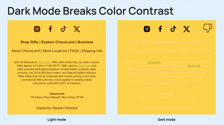
The Business Impact of Poor Email Rendering
- Users lose trust
- Click-through rates drop
- Conversions decline
- Unsubscribes increase
How Email Rendering Works (Behind the Scenes)
To understand how to fix rendering, it helps to know what actually happens after you hit send.
- You design and code the email
- Your ESP sends it
- The recipient’s email client receives it
- The client interprets your code
- The email is displayed
The key issue?
Every client interprets that code differently.
How to Fix Email Rendering Issues
Fixing email rendering isn’t about making your email look perfect in one environment—it’s about making sure it works reliably everywhere. That requires a shift from design-first thinking to compatibility-first execution.
1. Design for Compatibility, Not Perfection
The biggest mistake marketers make is designing for a single “ideal” version of an email. In reality, your email will be viewed across multiple clients and devices.
Instead of chasing pixel perfection, focus on clean, structured layouts that hold up across environments. Simpler designs not only render better but also load faster and perform more consistently.
2. Use Email-Safe Coding Practices
Email development comes with limitations, and working within them is key.
Use inline CSS instead of external stylesheets, as many clients ignore external code. Structure your layouts using HTML tables rather than divs, since they offer far better cross-client support. Avoid modern CSS dependencies that may break in clients like Gmail or Outlook.
What may feel outdated is actually what ensures reliability.
3. Design Mobile-First for Real Users
With over half of emails opened on mobile devices, your design should start there—not adapt later.
Focus on:
- Readable font sizes
- Clear spacing between elements
- Large, thumb-friendly CTA buttons
If your email works well on mobile, it’s far more likely to scale effectively across other devices.
4. Always Include Fallbacks for Key Elements
Not everything loads the way you expect, so plan for failure.
Add ALT text for images so your message still communicates even when visuals are blocked. Use web-safe fonts or fallback font stacks to maintain readability across clients. Ensure your CTAs are built as bulletproof buttons, so they remain clickable regardless of rendering issues.
Your email should still make sense, even when parts of it don’t load.
5. Test Across Email Clients Before Every Send
No matter how experienced you are, you can’t predict rendering behavior across all environments.
Always test your emails across major clients like Gmail, Outlook, Apple Mail, and mobile devices. What looks perfect in one inbox can easily break in another.
Testing helps you catch layout issues, broken elements, and inconsistencies before your audience does.
6. Design with Dark Mode in Mind
Dark mode is no longer optional, it’s a standard user preference.
To avoid rendering issues:
- Use strong color contrast for readability
- Avoid relying on transparent images
- Test how your email appears in dark environments
A design that works in both light and dark modes ensures a consistent experience for all users.
7. Keep Layouts Within Safe Width Limits
For consistent rendering across devices and clients, keep your email width between 600–700 pixels. This ensures your content displays properly without breaking layouts or forcing horizontal scrolling.
8. Avoid Risky Design Elements
Certain elements still don’t render reliably across email clients. For example, background images in critical sections may not display correctly in many inboxes.
Whenever possible, prioritize structure and clarity over decorative complexity—especially in key areas like CTAs and messaging.
Why Testing and Tools Matter More Than Ever
As email environments become more complex, manual checks aren’t enough.
You need:
- Cross-client previews
- Rendering diagnostics
- Pre-send validation
Without this, you’re essentially guessing how your email will appear.
The Role of Testing in Email Rendering
No matter how experienced you are, you can’t predict how every email client will behave.
That’s why testing isn’t optional, it’s essential.
Before sending any campaign, you need to see how it renders across:
- Gmail
- Outlook
- Apple Mail
- Mobile devices
What works in one might break in another.
Testing allows you to catch:
- Layout shifts
- Broken buttons
- Font fallbacks
- Dark mode issues
And fix them before your audience sees them.
Common Email Rendering Mistakes to Avoid
Then explain (not just bullets):
- Designing in tools but not testing in real inboxes
- Using unsupported CSS (flexbox, position, etc.)
- Image-only emails without fallback
- Ignoring Outlook-specific issues
- Not optimizing for dark mode
Where Technology Makes the Difference
Final Thought: It’s Not Just About Delivery, It’s About Experience
Most marketers focus on getting emails into the inbox. But delivery is only half the story.
Your audience doesn’t see your code, they see the experience. And that experience is shaped by rendering.
So the next time your campaign underperforms, don’t just analyze subject lines or offers. Look at how your email actually appears in the inbox.
Because in email marketing: It’s not just about reaching the inbox. It’s about looking right when you get there.