- March 12, 2025
- by Parbeshkumar Maurya
Designing Emails for Nighttime Readers with Dark Mode
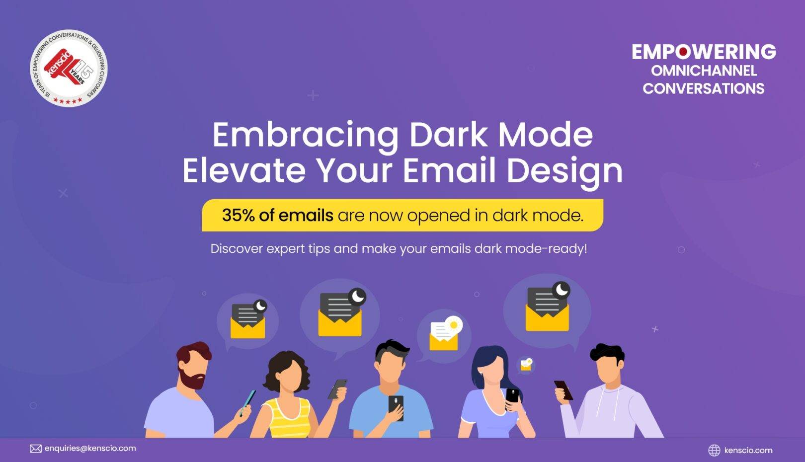
Dark mode has become a significant trend in digital design, with a substantial portion of users preferring it for various reasons. As of 2022, approximately 35% of email opens were in dark mode, indicating its growing adoption. For email marketers, optimizing campaigns for dark mode is essential to ensure readability, engagement, and a consistent user experience.
Why Dark Mode Matters in Email Marketing
Dark mode offers several benefits that enhance the user experience:
- Reduced Eye Strain: Dark mode minimizes screen brightness, making it easier on the eyes, especially in low-light conditions.
- Battery Conservation: Devices with OLED screens can save battery life when displaying darker pixels.
- Aesthetic Appeal: Many users find dark mode visually appealing, leading to a preference for darker interfaces.
However, designing for dark mode presents challenges, such as ensuring that images and text remain visible and that branding elements are consistent across both light and dark themes.
Pros and Cons of Dark Mode for Email Marketing
While dark mode enhances the reading experience, it also comes with unique design challenges. Here’s a breakdown of its benefits and drawbacks.
Pros of Dark Mode for Emails
✔ Reduces Eye Strain – Dark mode minimizes brightness, reducing visual fatigue, especially for nighttime readers.
✔ Conserves Battery Life – OLED and AMOLED screens consume up to 30% less power in dark mode.
✔ Modern and Aesthetic Appeal – Gives emails a sleek, contemporary look that resonates with tech-savvy users.
✔ Boosts Engagement – Emails optimized for dark mode have a 15% higher read rate than non-optimized ones (Litmus).
✔Enhances Readability for Nighttime and Low-Light Users: Over 64% of Gmail users access emails on mobile, where dark mode is widely used.
Cons of Dark Mode for Emails
❌ Color Inversion Issues – Some email clients automatically invert colors, which may distort email design.
❌ Logo and Image Visibility Problems – Logos with transparent backgrounds can disappear or blend into the dark background.
❌ Inconsistent Rendering Across Platforms – Dark mode isn’t standardized; Gmail, Apple Mail, and Outlook handle it differently.
❌ Contrast Challenges – Pure black (#000000) and pure white (#FFFFFF) create harsh contrasts, making emails harder to read.
❌ Disproportionate Effort: The design requires extra effort now to be compatible with dark mode.
Best Practices for Designing Dark Mode-Friendly Emails
Use Transparent Images and Logos:
- Utilize PNG images with transparent backgrounds to prevent unsightly boxes around logos or graphics. For instance, if your logo has dark text, it might disappear on dark mode backgrounds. A simple solution is to add a white stroke or outline to maintain visibility.
✍🏻 Add light-colored outlines or shadows to dark logos to maintain visibility against dark backgrounds.
Optimize Color Contrast:
Avoid pure black (#000000) and pure white (#FFFFFF); instead, use off-white and dark gray shades to reduce eye strain. Instead of using pure black (#000000), opt for a softer dark gray (#121212) to prevent extreme contrast. Similarly, use off-white (#F2F2F2) instead of pure white (#FFFFFF) for a more balanced look.
✍🏻Ensure sufficient contrast between text and background colors to maintain readability.
Test Across Multiple Email Clients:
- Dark mode rendering varies between email clients like Gmail, Outlook, and Apple Mail.
✍🏻Use testing tools to preview emails in both modes and adjust designs accordingly.
Adjust Call-to-Action (CTA) Elements:
- Design CTA buttons with borders or contrasting colors to ensure they stand out in both modes.
✍🏻Test button visibility to maintain click-through rates.
Implement Dark Mode-Specific CSS:
- Use media queries to define styles for dark mode users.
✍🏻Example:
css
CopyEdit
@media (prefers-color-scheme: dark) {
body {
background-color: #121212;
color: #ffffff;
}
}
The Future of Dark Mode in Email Marketing
As dark mode usage continues to rise, with 81.9% of people preferring dark mode whenever possible (Source: Android Authority). Email marketers must adapt to this preference to maintain engagement and accessibility. Incorporating dark mode considerations into email design ensures a better user experience and aligns with current digital trends. In future we can see
✅ AI-Driven Email Design: AI-powered tools can automatically adjust email colors and elements based on the user’s theme preference, improving user experience.
✅ More Customization Options: Future email clients may allow users to set custom dark mode settings, requiring marketers to design flexible templates.
✅ Dynamic Theme Adaptation: Email frameworks may evolve to automatically switch between light and dark modes based on the recipient’s preferences.
By embracing dark mode and implementing these best practices, you can enhance the effectiveness of your email campaigns and cater to the preferences of a diverse audience.
